EN

.svg)

Have you ever stopped to think about how colors affect us? Why do you feel so certain of your favorite colour? Why do you associate certain colors with certain feelings? How do you perceive different brands based on the color they chose to represent themselves with?... All these feelings may seem random, but the truth is they’re not.
In this blog, we’ll dive into one of the oldest marketing techniques known to mankind: color psychology and its role in modern branding.
Although there's a specific name tied to color psychology theory — Johann Wolfgang von Goethe, and his book Theory of Color — humans have been studying color and its effect on our species for centuries, dating back as far as ancient Egypt.
While actual scientific studies were not their main goal, ancient civilizations understood that different colors affect us in different ways:
Nowadays, color not only affects our feelings and perspectives on certain brands, but the chosen hue of said color can also signify a plethora of other things, such as social status, brand heritage, and even dictate a role in the customer journey.
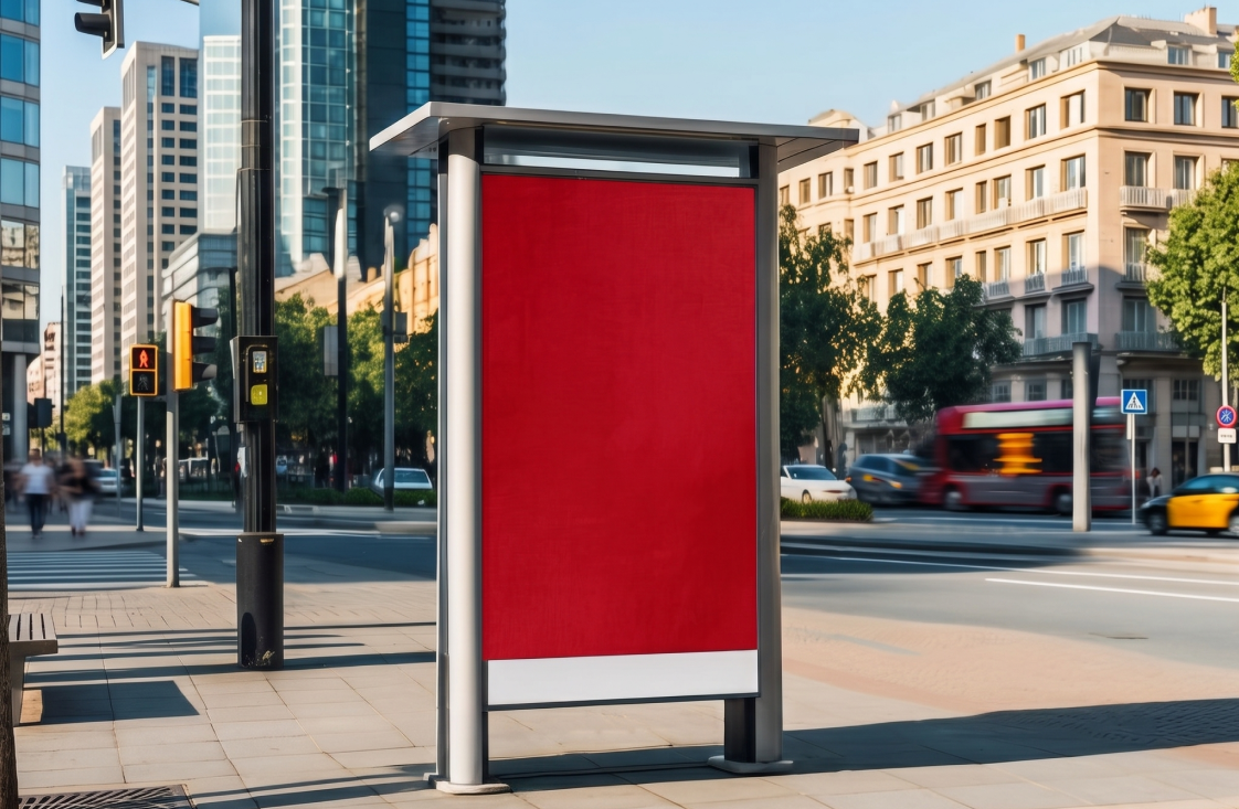
For example, a red sign in a store almost always means some type of sale, which brings a sense of urgency to customers and makes them more willing to buy something (and do it quickly). Also, data shows that red call-to-action buttons tend to boost conversions by 34% compared to other colors, making that little red "Buy Now" a very deliberate decision and not just a random designer’s choice.
Colors are often strategically deployed in branding so that our brain builds an automatic connection between specific palettes and brands. Take the Coca-Cola red, for instance, or even the Hermès orange. In fact, color is so important that 81% of consumers admit to recalling a brand's color, while only 43% recall its actual name. Yes, you read that correctly! A color can and probably will outlive a name in our memory.
Ok, but what do all colors actually represent in our brains?
Let's break down what the most common brand colors are communicating to your subconscious, because yes, this is happening whether you realize it or not.
Blue is the overachiever of the color wheel when it comes to branding. According to Adobe, 54% of consumers say blue is the most trusted brand color, and it's the go-to for tech companies, banks, and healthcare brands.
Red triggers something primal. It raises your heart rate, creates urgency, and stimulates appetite, which is exactly why it dominates fast food branding and clearance sales. It's the color of "act now, think later."
Green is the color of calm, growth, and conscience. Brands leaning into sustainability, wellness, or the outdoors reach for green because it signals alignment with nature.
Black and white are the quiet flex. Neutral colors like gray, white, and black are frequently associated with refinement, simplicity, and elegance, and, in luxury branding, they are used to imply professionalism and high-quality.
Yellow and orange radiate optimism, warmth, and energy. But be careful! In the right hands, these colors feel approachable and vibrant, but in the wrong context, they can be read as cheap rather than cheerful.
Although color theory, when paired with human behaviour, shows that certain hues may affect us differently, it's also important to say that different cultural backgrounds mean different color associations. For example, in Occidental cultures, white can be a symbol of peace and neutrality. While in other Oriental, Middle Eastern, and African cultures, white is most often tied to mourning and reincarnation.
Red, especially in China and India, typically symbolizes luck, prosperity, joy, and vitality, a meaning that couldn't be more different from the urgency and danger it signals in the West.
Why does this matter so much? Because marketing might be all about data, strategy, and patterns, but it's also deeply human, and there's nothing more human than understanding other people and their experiences.
Think of it this way: if you were creating a campaign that would run from Times Square all the way to Shibuya Crossing in Japan, you would have to think carefully about the colors and the cultural weight they carry. The goal isn't just to be consistent, but to always be understood. And sometimes that requires thoughtful adjustments to make your campaign relate to the people you're trying to reach.
Every time you pick up a product, click on an ad, or feel oddly drawn to one brand over another, chances are color (and the psychology behind it) is part of that equation as a mastered psychological tool in human history, refined by science and wielded by the best marketers with precision.
The brands you trust, the ones that make you tick, the ones that make you feel something before you even read the tagline… that’s not a coincidence. It’s all part of the big plan to grab your attention… one Pantone at a time.
So, the next time you walk into a store or scroll through your feed, pay attention to what the colors around you are trying to make you feel.
Do you need help communicating exactly what you want? Send us an email right now, and let's kick things off!